Monday, 20 May 2013
Scanned Emotions

This piece was for the scanned emotions project, and for it I had my face with gray and black background and a ton of editing and effects and trimming. Basically it's my face with an overload of gray and black and somewhat blackish light brown into it. The only unique thing about it is the plant design with low opacity in the middle of the face part.
The picture has no pattern, being a portrait and singular subject/object, and there is the face to be contrasted against the darker background. It has the emphasis on the face of the subject, and has asymmetrical balance, yet again because the leaf pattern, and the background. There is unity in it, it is not terrible to look at as a whole, and the other elements seem to work together.
The picture means that I am writing this at 3:38am and cannot even think about what I am supposed to be filling in here.
I felt like this picture was very successful in portraying the emotion that I was given to represent, apathy, because of how disconnected this picture feels. The gray and black were colors chosen to best represent it and help out he unity considering the emotion given. I personally think it looks better than average compared to the rest of my sorry works.
Ad Redesign

This piece is for the ad redesign project, which was to find an ad and recreate it to send a different message than it was intended to. This ad is from Mcdonalds and shows an employee who looks utterly drained and pretty much a windup-toy. As in there is a wind-up in his back, and he has a heart that is apparently bleeding out of his chest, and a suitcase filled with Mcdonalds related papers.
There is no pattern, singular subject for this piece, and no contrast because nothing really sticks out, most colors are the same or closely related. The man might be emphasized and of asymmetrical balance, but that doesn't exactly count for much, considering most of my projects are like that. The picture conveys some unity, it is alright to enjoy with your eyes so I would consider it to have unity.
This piece means or represents the tired and broken down employee that Mcdonalds has working for them, because you know minimum wage. There are two messages hidden in this image, the first is that Mcdonalds is an evil corporation that wants you to drink it's coffee so you can work harder for it. The second is that I am slowly losing my sanity writing all of this (50ish paragraphs done in one sitting).
I feel like this image is successful in showing the evils of the Mcdonalds corporation or at least their criminally bad coffee skills. I think it has a decent amount of unity, but it just looks too bland, not enough going on to justify calling it a true redesign. The picture could have done with more changes to the actual ad, like color or text, or changing any core part of the original structure.

Childhood Memory

This piece was supposed to be for the childhood memory project that we did about something that reminds about your childhood. In this picture we have a swingset, a kiddie ride, a kid holding a balloon, a pigeon in the sky, and a shovel, a paper airplane, and Thomas the train engine. These were all things I remember were around when I was a kid but maybe not for everyone or in the right places.
There isn't any pattern in this picture, and I don't think anything is actually being contrasted either, and it also appears nothing is emphasized. There is asymmetrical balance like almost every other project I've done, because nothing in this picture lines up with the other side. Unity doesn't exactly work in this piece, everything seems a little bit too scattered out and nothing makes good sense.
The piece means that I am really tired because this is pretty late at night and it's my nth cup of hot stuffs. I think the message in this picture is that to remember the old days is always something you should do once in awhile. It is a healthy thing for people to do (relive their childhoods), sometimes people never get to do that, if you have time, try it once in a while, it certainly isn't like you can relive it presently.
I thought that this picture was moderately successful, it got the message across about the childhood memories subject, but failed in other things. By that I mean it looks pretty damn bland, and should have had other effects or things added to it to change stuff up. I would say it gets a moderate rating for art, but hell your opinion is more important than mine to be honest.
Dream Scene

This piece is for the dream scene project, where you had to create a picture that represented some kind of dream or something related to that basically. So what I did was get a picture of a place in the presidio, then get a picture of a sign nearby that road. Then I got a bird and put it on the sign, cut both out and put in, put myself in it, and put in the sky from a different picture into it.
This piece has no pattern, but it does have contrast, the sky differs in color widely from the color of the land below it. There isn't anything being emphasized particularly in this picture, because there are two different objects that are around the same height on each side of the picture. I think there is unity in this picture because it just sticks together, and because being of a dream it can be allowed to look strange.
This piece means that during a dream, at one point it involved being in Presidio park and having a bird on a sign. It also means the sky was bleakly bright, and clung to the horizon for some reason, and despite that the sign the bird was on had a shadow of something on it. So from this, you should be able to conclude at this point, I don't think there is a hidden message or something in it.
I felt that this one was successful, it represented the dream sequence well in one image, and had enough surreal value it's dream title can not be doubted. Honestly, this picture actually made me stay up to make sure the light in the sky was trimmed properly. Anyways, it is one of the better pictures I have made in this class, by virtue of actually working and not slacking off the whole time.
Personal Collage

This piece is for the Personal Collage project that was assigned to us a few months back, in which you needed to put things important to you in it. Something that I noticed was that opacity was to be pretty low to blend it in seamlessly with the background, I may have overdone it. The opacity of my objects is so low, only a few are even basically visible, which detracts from the look of this piece.
It has no pattern, being a landscape kind of picture, with the sun contrasting with the shadows resulting from sundown. It was supposed to be that the objects important to me were going to be emphasized, but the opacity on them makes them for almost all purposes invisible. It has asymmetrical balance and I believe uses Unity well, because everything looks in place except the objects with terrible opacity values.
This piece actually has a message unlike most of the other ones, and this picture I took on the beach at 6-7PM recently. To get it, I basically waited for about ten minutes or so for the sunset to look good enough for the picture, then I lined up a faraway boat with two people standing on the beach. The message in this picture has to do something with spending time with people, it certainly won't last forever, why not enjoy the moments.
I felt that this was mildly successful, because although I got the scenery part of the piece right, I messed up the personal objects part. Despite the lack of visibility on the personal objects, I remember a version I made of it where it was possible to see them, I disguised them because they looked terrible with too much opacity, apparently I got the combination wrong and they are too see clear.
Surreal Self Portrait

This piece was for the surreal self portrait project, which was to me another self portrait project pictures, so I decided to do something wacky. Essentially what I did was take a picture of the Golden Gate Bridge one day, and then use an old picture of me from earlier. I took the old picture of me and enlarged the height so that I was taller than the bridge despite being far away from the top arch.
There is no pattern in this picture, focuses on singular objects, the picture of me contrasts well to the bleakness of the bridge. I am being emphasized by being taller than the top arch of the bridge, and this picture has asymmetrical balance like most of my pieces do. This picture has unity because the elements of design that are present appear to be working, although I should have added something extra it doesn't matter.
The piece means something with some kind of hidden message, I think it means something that involves getting taller. In my opinion, the message is, if you try, it doesn't matter on the outcome you get better/taller because you tried, not what happened after. Although my opinion might not matter anymore after doing so many of these descriptions, still up to the viewer to decide like all art.
I feel that it is successful, in making a very surreal kind of picture with me being taller than the Golden gate bridge and all. The elements of design work decently in this piece, not completely ignored while not sticking out too much. The picture's worth is up to the viewer to decide, despite me thinking that it's decent but not spectacularly interesting.
Warhol Portrait

This piece was made for the Warhol Self Portrait project, so basically a self-portrait done in the same way as Andy Warhol's famous Marilyn Monroe picture. It is my face but looking very strange because apparently my mouth turned out that way when the colors were added. The same problem occurred on the eyebrows of my face, I think the features got changed once colors came in because they overflowed.
This picture does have a pattern, with all the repeated versions of my warped looking face about 12 times in the piece. Nothing is being contrasted in this picture, nothing is being emphasized in it either, this piece is designed to be looked at in whole not in a singular form. This piece has asymmetrical balance because the colors don't match on each side and such.
This piece is supposed to represent or pay tribute to the one Andy Warhol did on Marilyn Monroe, which definitely was clever on his part. This one however probably doesn't have the message that Andy's did unless you count that people see different people in the same person. Besides that however, I've got no clue unless you want me to make up some deliberately unnecessary message hidden in it.
I felt that this one was successful, it worked out better than most projects I worked on, primarily I tried on this one more than usual. I think it was because I thought that it was simple and didn't take too much thinking on it, because we had the idea already in our heads. It looks comical because of the facial expressions that were mistranslated to be honest with you, it's up to the viewer to decide if it looks good or not.
Create your own reality

This piece is for the project titled "Create your own reality", in which you have to create a work that defies logic or in some ways, comprehension. So pretty much we have two of my cousins going up a hill on the water reservoir near my house in the sunset. There are seagulls in water puddles around the ground in the slope/hill, which doesn't make any sense but that was the point.
This piece does not have a pattern, or in fact anything that might resemble a pattern unless you count the seagulls as repeating objects that are similar to each other. There is no contrast, almost everything in this picture happens to be colored similarly dark, except for the birds which are slightly brighter. Nothing being emphasized, the picture is meant to be seen as a whole and not specific parts. Has asymmetrical balance, uneven sides if you split the picture in two, and not radial because it's not circle patterned/oriented. Not exactly unity but it manages some parts of the elements of design, unfortunately not enough for me to say it has unity.
This piece has the "your own reality" kind of theme to it, so basically this reality that you can see in the picture is radically different than ours, and so birds stand in land puddles. While something like that would sound insane or drug-influenced, due to this project involving creating the wackiest things ever, it makes sense. I might have done better, had I thought of this project a little more, perhaps some bears or flying elephants would have helped this out.
I feel that the piece was successful in making it seem like you were looking at some alternate reality, which was the ultimate point. The elements of design work out moderately well in this picture, it isn't exactly going to win a damn award or anything. The water puddle by the middle of the hill is done unprofessionally, something I forgot to fix or maybe just didn't care much for.
Digital Calendar
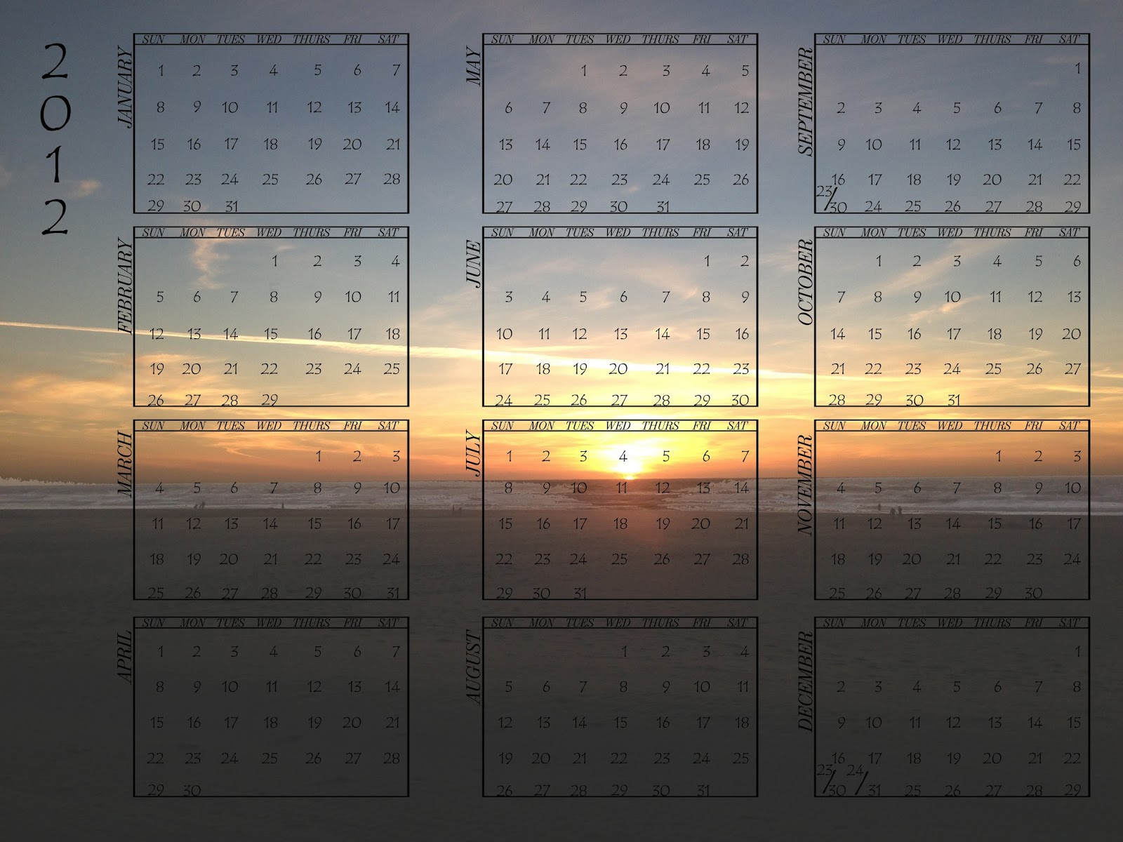
This piece is part of the digital calendar assignment, and as such is a calendar with the background of a sunset in it. The calendar is see-through with the 2012 months on it, and paired with that sunset in the background, you could print this out and put this on a wall or something. The sunset came out of a series of pictures taken at Ocean beach at around 6-7Pm, something that is not comfortable to do.
I would not consider the calendar to possess any pattern unless you counted the calendar boxes as a pattern, but in general I would consider that stretching it a bit. The contrast is the light parts at the top of the piece and the dark ground at the bottom, basically. Nothing is being emphasized in particular, because everything is the same distance away from the picture's viewer. It has asymmetrical (seriously?!) symmetry because the right side is larger than the second side and makes it uneven, also the sky has different clouds. There is unity, because the contrast, emphasis, and balance work on the landscape type background behind the calendar.
I am not exactly sure if there is any message in this calendar, this is because I did not make this with any purpose in mind besides completion. To be honest with you, if you think there is a message in this piece, then by all means have fun with it. However to me I can't exactly tell if there is a message because there literally was nothing in my thought process that told me to put a message into it.
I feel that this picture was successful, in making a good looking calendar with the background visible without taking out the calendar entirely. The elements of design work out to create unity, well I'm not exactly sure of that completely considering there isn't any dramatic changes that were necessary but still. Despite being a simple project, I think this one looks pretty alright, compared to some of my other ones.
Visions of Music (not including actual music)

This piece is for the visions of music project, in which you got a picture and created something that matched what song you decided to put it with. Basically it looks like a warped line of water going vertically upwards, with water droplets all around it and a steel wall with the water on it. The top and bottom areas of the picture are darkened and only the middle area contains enough light to comprehend water all around.
This one's pattern could only be a pattern if you counted the water droplets on the wall, which are by the way common and repeatable-looking, as a pattern, in which case it would. Contrast would be the middle brightness compared to the darkness of the ends of the top and bottom of the picture. The stream of water positioned horizontally is emphasized because it is the only thing to focus on throughout the work/piece. The balance is asymmetrical, it is tilted slightly and is uneven technically. Not sure if there is unity, there isn't anything else that works together, the background maybe because it is bright and helps the stream with a shadow.
The piece means that if you have a good camera, or someone you know does, borrow it and screw with it until you come up with something like this on a random setting. Although I did plan on the picture looking like this beforehand but I was originally hoping for a perfectly undisturbed one, this worked just the same. I am saying that only because I did not expect the lighting to turn up like that on the wall of the sink.
I thought that this piece was successful, when put to the tune of Marty Robbins singing "Cool Water", it turned out just fine in the end. The elements of design work decently well out of it, there isn't much actually unity in it though, something I found interesting but I couldn't think of anything to fix it. It looks unique because of the water just floating there in the air, and the lighting it got with the shadow behind it and the gleam.
Animal Logo

This piece is the logo that we were supposed to do for this assignment, I personally thought this one was one of the most interesting and rewarding projects during this class. It has an aardvark and a rhino in the first capital B, followed by a hummingbird, and then a leaping animal, which I believe is either a tiger or a cheetah/puma. I personally only like the first two as inverted/upside down versions of it are not as interesting to look at because they are hard to actually comprehend.
The pattern in this piece is in the letters and colors used being that the whole picture is repeated four times with different combinations like color inversions and being backwards. The black and white backgrounds and coloring for each letter are being contrasted visibly. My name is being emphasized throughout the picture in black and white, about four times in a row. It has symmetrical balance although maybe not because the backwards side is different in content and the black and white blocks never line up, so asymmetrical. Yes unity is here, the elements work together and it looks good with the easy to see contrast and the emphasis lets you look at the animals used in it.
The piece was supposed to just be your name with objects or animals through them and visible during color changes, which I thought was simple and rewarding, well maybe not that simple. To make this one, we had to put the actual picture of the animal into the letters and extract them out but left the shape of it still there. In other words I forgot the actual procedure of it but that is my vague understanding of what we did.
I thought this one was good and actually successful unlike most of my other works, but then again during this project I actually paid attention and tried unlike some of the other works I have. I believe it came out with the elements of design still intact and is something I am proud of making. The connection with animals instead of objects, is something resulting after watching too many nature/animal planet related things and I don't regret time spent watching them.
Expressive Portrait

This piece is supposed to be for the expressive portrait project, if I remember this one was about making a portrait expressive. So basically for this I took a picture of my sister and made it really bright, and the sand also got really bright. The point was that she was smiling, which usually is an indicator of happiness, which is represented by visually bright backgrounds and themes.
No pattern, singular subject with background behind it, patterns would be technically impossible in this scenario unless something crazy happened that altered the piece. The thing being contrasted is my sister, because being the darkest thing in this picture, it contrasts strongly with the bright sands behind and near her. The thing being emphasized in this picture is my sister being that it's a single subject picture with background behind, and is the only thing you can focus on. It has asymmetrical balance, along with almost every single one of my other works because that's just simpler and happens most often anyways. It has unity because, containing all the other elements of design, the piece feels connected with the brightness and details.
The piece was basically just me trying to figure out what to do and having a picture of my sister, I decided to act on it and came up with this. This picture looks nice in combination with the sands, or at least the effect is when you see the sands almost vanish due to the color near the top of the piece. I have decided to say that this picture doesn't carry any individual message, at least from me, I am sure other people can make their own conclusions and I will just leave them to it.
I felt that this picture was successful as you can find the expression in it, and the background worked with the lighting to develop the effect near the top of the piece. The elements work together because the whole thing, is contrasted, emphasized, contains balance, and has unity. My only gripe is that, it looks kind of bland as you can kind of tell what it is at first glance and won't think anything different of it.
Unity

This piece is representative of the element of art known as unity, and in general I thought that it did an average job of representation, I will explain the rest of this in the following paragraphs. Basically what the picture contains, is a rock formation in the desert that is multi-colored and darkened in the ground. However the light in the sky is still bright and intense despite the color of the ground and the rock is a mixture between too bright and too dark.
There is not existing pattern in this picture, you know singular patterns for individual picture contents and other things related to that matter. The thing(s) being contrasted in this picture is the darkness of the ground and the brightness of the sky and maybe the rock face. The thing being emphasized is the rock face, it is the most enlarged of the features in this picture and the one with the brightest or most vibrant colors around. It contains asymmetrical balance because it is a singular figure, and has almost nothing else to focus on unless you like to focus on backgrounds. I believe it has unity because the elements of art happen to work together in it, and you can kind of look at it in that landscape view of the background.
The art was supposed to be for the element of art known as unity, which made me try to have all the parts fit together. You could say that it's message is that together, you'll always find parts you like and parts you don't, try to find the middle ground. That is because in-between the extremes you should be able to find the parts you want from both parties.
I feel that this one was moderately successful in it's job to promote the usage of unity, primarily because it had the elements working together, but not in full swing. The explanation for this is that, under limited time constraints or me just being lazy as is common with these pictures it's just not done above average. There is just kind of a lack of coherence through the whole thing, but in perspective looks just fine.
Contrast (Or Type face because I that's what I turned into my drop box)

This piece was made from letters and symbols of different fonts, and the only modification I was allowed to do, was size and layering. The piece is basically an old man put together with letters of black and white, he has a tie and a cane, with trimmed moustaches and shaved beard hair. He has a moderate haircut, bordering a buzzcut and has eyebags and a belt, I went with gut instinct making this picture, and it developed from a normal human into an old man.
No pattern being a singular figure, and having nothing in the background that would in anyway hint that there was a pattern anywhere else in this piece. Nothing to contrast unless you count the old man being colored white against the black background, which is technically contrast, yeah I guess it does have contrast. The only thing to emphasize is the old man which I guess the piece does pretty well considering he is contrasted against the background. Asymmetrical balance yet again because there isn't a pattern, no pattern around a circle kind of design, and because the two sides are unequal. I don't think it has unity because not all the elements of art work together, and because as a singular object it wouldn't include anything that involve multiple objects (ie: Unity).
The piece represents an old man, looking at the viewer with longing eyes, I am going to assume he is homeless or something and would like your help or attention. The previous statement is something I made up in a flash and honestly did not expect to do because I made this piece up as I went. The message would probably be to help out homeless people, but the artistic message would be that sometimes making up art as you go isn't so bad after all.
I feel that artistically it is successful as it could be much worse as i've seen before, but in that same way I maybe could have added something to spice it up. What I mean is that, considering all the other entries for this same project, it could have been more interesting, this is a generic old man technically. Despite that, being made with only letters and symbols, it looks good for the way it was made and with that limitation.
Balance

This piece or work is supposed to demonstrate the element of art known as balance, and is technically asymmetrical balance. What it contains is a fiery looking background divided in three different parts, with different words taken from cut images out of magazines. The messages refer to some kind of recruiting poster for an anti-machine group, something I was thinking about during it's creation time.
There is no specific pattern in this picture, and is asymmetrical, so to conclude with that, definitely no specific pattern anywhere in this picture. In the matter of contrast, I could say that each layer or section of the piece contrasts each other despite having only minor changes in brightness and color. The thing being emphasized is the letters and words that involve being recruited into an anti-robot group, which was the primary point of this so I would say it has emphasis. It has asymmetrical balance, which I admit is getting really common in these critiques, but as it is not symmetrical or has radial balance, it's asymmetrical. Being that it contains most of the other elements of art, it contains unity in it's repertoire.
The piece is supposed to be representative of some kind of flaming poster that is on some building that was destroyed by the robots. The building was destroyed because it was supposed to be a rebel base, as evidenced by the poster on the wall advertising to join the anti-robot rebellion. This seems waaay too dramatic but unfortunately that is what I came up with during development, whether or not I could have had better ideas is now a moot point.
I felt that it was successful in at least representing the poster of an anti-robot rebellion, but the words need some editing to be made better. The elements work together pretty good to create unity, I maybe should have made it look a little bit neater but as it is i'd accept it. While not neat, at least it's something you can look at without immediately dismissing it as terrible but still should have been done cleaner.
Emphasis

This piece is supposed to represent the element of art known as Emphasis, which is usually used to make one object or thing in a work to stand or stick out. To describe it for you, basically it is a teacup on a plate in some restaurant somewhere, with an unnecessary amount of blur added to it. It really confused me why I did this because instead of emphasizing the picture it just made it annoying to look at.
It has no pattern, it is a large, perhaps overly large teacup with ridiculous amounts of blur, so pretty much no, I don't believe it does have pattern. It has no contrast, because besides the contrast of background and large teacup there isn't much else to see around there. The teacup is supposed to be emphasized in this picture but no, I just see an incredibly blurred picture of a teacup, so no. Contains no balance except for asymmetrical because most parts of it are even being mostly focused into the center of a large teacup plate combo. Does not contain unity, I am pretty sure about that, mostly due to not having any parts of the elements of art.
This piece, I think has misguided meaning, probably as a result of my poor art skills or lack of effort on my part in this picture, something I am not exactly pleased to know.The message was supposed to be about emphasis or to show what it looked like, and the teacup with the blur obviously showed at that moment I took that to be emphasis. So in conclusion of the two sentences before this, I definitely don't think that it represents emphasis despite that being what I made it for.
I do not exactly feel that it is successful, for more information on that refer to the paragraph literally above this one and use reading comprehension. The elements of design did not work out for this one as pointed out in the second paragraph, repeat steps used in previous sentence. I don't think it looks good or is neat, the blur makes it hard to look at without being disoriented or having the whole thing incomprehensible.
Repetition

This piece of art was made to demonstrate the element of art known as repetition, which is shown along with it's fellows, in the following series of works I put up. To describe it, there are four circles in the four corners of the piece, where a large white circle takes up the middle of the work. The left side of the picture is blue, the right side contains orange, and the middle contains purple from being combined.
There could be considered a pattern, because there are technically five circles and in the same piece and additionally because circles make up the damn thing anyways. Contrast would exists between the white circle space in the middle, and the blue and orange colors on either side of the picture, so I would say yes. Nothing is being emphasized in particular, because there isn't much to really look at that should have been emphasized, I guess you could say the middle circle space but that would certainly be a stretch. It contains symmetrical balance so long as you are willing to overlook the color differences, which I would look past so yes. It should have unity, which means it has some small part of all the other elements of art, described in my previous sentences.
I am not exactly sure as to what my thought process was or desire/intent was creating this one, but I assure you it had to do with circles. Moving on from that the blue and orange clearly suggests I was thinking about Portal, a popular video game series known for such circles in blue and orange. Besides those clues I have nothing else to really add about it besides I didn't exactly do my best in it.
I felt that it was successful in proving that my train of thought had been disturbed by unrelated ideas but besides that I am not so sure. As explained previously in the second paragraph's ending, I believe that all the parts/elements worked to make unity in the work. It is most certainly not done neatly, personally I think it looks rushed or sloppy because the proportions are so out of place it doesn't look right.

Photo Edit

This piece of art was made to demonstrate the simplicity of editing a photo to make it seem either more realistic or in this case more radical/interesting. To describe it like it was made, it was a picture taking while in the fresh produce section of Safeway, and it's a bunch of pineapples together. The interesting special effect is the right half of the picture appears to have deeper, or more reversed colors to the first one. With this contrast, it demonstrates the effect, I believe it was reverse color, or it was auto-level. Either way the effects show through the picture and proves its point through the middle.
There is no clear pattern in this picture being two different lines or sides, it only contains two sides that are clearly different from each other. The thing being contrasted is probably the pineapple or original side of the picture (left side) and the right is the reversed side. The different colors from each side is what is being emphasized the most being that the colors are so radically different. Balance would be asymmetrical, nearly symmetrical but each side has different content, making it asymmetrical. I would think it has some kind of unity but not as much as it would or should be because I put the line of division in a strange spot bordering the left pineapple.
As explained in the first paragraph, my explanation is that it helps display the easiness or lack of work to change a photo into something differently in a small amount of time. That would be the easy way to explain it, I can't exactly remember the thought process it took to actually create this one but it was basically the first reason and me experimenting with paint.net. Therefore as a result of that, I managed to get this picture done, which I will not admit is my best work but I would assume somewhat presentable.
I felt that in conveying the message it was designed to carry it did a pretty good job, and that is basically it, not anything special about in particular. No, because although contrast and emphasis were successful in my eyes, repetition was a dead weight here and balance is asymmetrical-like which is acceptable. I thought this one was done neatly, but of course being the creator I also found the division line too close or not done right bordering the left pineapple, otherwise it looks fine.
Subscribe to:
Comments (Atom)